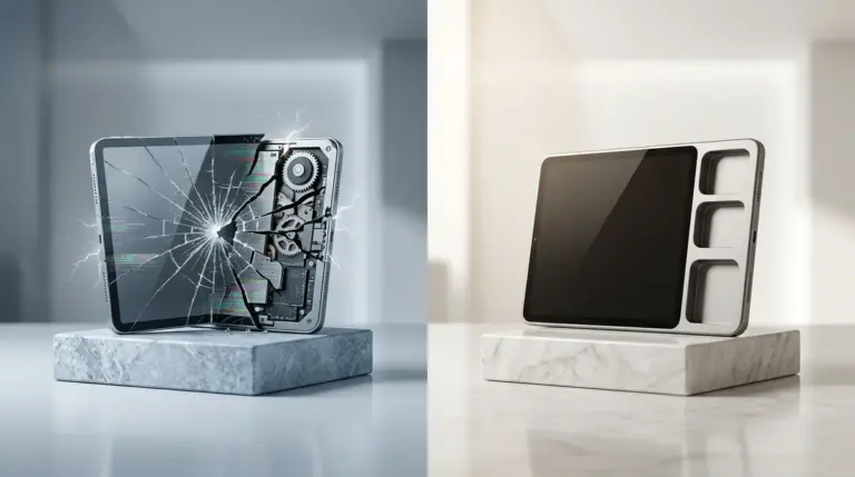


When a customer encounters a broken link or a sluggish checkout page, the resulting review is rarely a technical bug report. It is a visceral reaction. In the context of conversion rate optimization (CRO) and reputation management, UX friction is the primary catalyst that transforms a minor inconvenience into a public-facing brand crisis. For SEO professionals and site owners, understanding this transition is the difference between managing a constructive feedback loop and firefighting a PR disaster.
Friction occurs whenever a user’s mental model of how a site should work clashes with the reality of the interface. This cognitive dissonance creates a state of high arousal. In this state, users do not write objective critiques about "latency in the API call for the shipping calculator." Instead, they write that the brand is "untrustworthy," "frustrating," or "a scam." The technical failure is translated into an emotional grievance, which carries far more weight in the eyes of prospective buyers and search engine algorithms alike.
The Neurological Link Between Interface Lag and Negative Sentiment
Human psychology dictates that we attribute human-like intentions to digital interfaces. When a site loads slowly, users perceive it as a lack of respect for their time. This is known as the "online frustration effect." Studies in neuro-marketing show that delays as short as 500 milliseconds can trigger a spike in cortisol levels. By the time a user reaches the review stage, they are no longer evaluating the product; they are reacting to a perceived personal slight.
Best for: Product managers and UX designers who need to justify technical debt removal to stakeholders by linking it directly to star ratings.
When the amygdala—the brain's emotional processing center—takes over during a high-friction interaction, the prefrontal cortex, responsible for rational thought, takes a backseat. This is why "friction-induced" reviews are characterized by hyperbolic language. You will see an uptick in words like "never," "always," "worst," and "impossible." These are not descriptions of the product’s utility; they are markers of a hijacked user experience. It's clear that friction-induced reviews are characterized by hyperbolic language because the user's rational thought is compromised.
Specific Friction Points That Trigger Emotional Outbursts
Not all UX issues are created equal. Some flaws are tolerated as "quirks," while others are seen as systemic failures. The following friction points are the most frequent drivers of high-arousal negative reviews:
- Forced Account Creation: Interrupting the checkout flow to demand a password and email verification creates a "wall" that converts buying intent into resentment.
- Invisible Shipping Costs: Revealing high shipping fees only at the final click is perceived as a "dark pattern," leading to reviews that label the business as "dishonest."
- Non-Responsive Mobile Elements: Buttons that are too small to tap or menus that overlap content on mobile devices create a sense of powerlessness, leading to "unusable" ratings.
- Layout Shifts (CLS): When a page jumps just as a user is about to click a link, the resulting accidental click is often the final straw that leads to a one-star review.
Language Patterns in Friction-Induced Reviews
Analyzing the lexicon of negative reviews allows agencies to diagnose UX issues without looking at a single heatmap. Reviews driven by friction focus heavily on the "process" rather than the "outcome." If a review says, "The product is fine, but I'll never buy here again," the issue is purely operational. If the review uses words like "clunky," "confusing," or "loop," you are looking at a navigation architecture failure.
Warning: Ignoring "process-based" negative reviews because the product itself is high-quality is a strategic error. Search engines increasingly weigh user experience signals, and a high volume of "frustrated" language can signal to algorithms that your site provides a poor landing experience, regardless of your product's merit.
The "Vent" Review vs. The "Feedback" Review
It is crucial to distinguish between a customer who wants a solution and a customer who wants to vent. High-friction environments produce "vent" reviews. These are often long, rambling, and devoid of specific suggestions for improvement. They are designed to punish the brand rather than help it.
Contrast this with low-friction environments where a product might fail (e.g., a broken item arrives). If the UX of the return process is seamless, the review is often tempered: "The item arrived broken, but the return was so easy I’ll give them another chance." Here, the lack of UX friction acts as an emotional buffer, protecting the brand's reputation even when the physical product fails.
Quantifying the Cost of UX-Induced Volatility
The financial impact of emotional review language is measurable. A drop from a 4.5-star average to 4.2-star average—often caused by a single buggy update—can result in a 15-20% decrease in click-through rates (CTR) from search engine results pages (SERPs). Furthermore, emotional reviews tend to be longer and more detailed, which ironically helps them rank higher in "Helpful" review filters, giving them more visibility than short, positive reviews.
Differentiator: Unlike product-based complaints, UX-based complaints are entirely within the control of the digital team. You cannot always control a manufacturing defect, but you can always control the "Add to Cart" button’s responsiveness.
Auditing the User Journey to Neutralize Volatile Reviews
To prevent UX friction from poisoning your review profile, you must audit the "emotional peaks" of the user journey. This involves more than just checking for 404 errors; it requires a deep dive into the psychological flow of the site.
Real-Time Sentiment Monitoring
Modern reputation management involves catching friction before it hits a third-party review site. Implementing micro-surveys (e.g., "Was this checkout easy?") immediately after a high-friction action allows users to vent their frustration in a private channel. This "private venting" significantly reduces the likelihood of a public negative review. It provides the user with an immediate sense of being heard, which de-escalates the emotional response.
Strategic Steps to Align UX with Reputation Goals
To reduce the emotional volatility of your customer feedback, focus on these three high-impact areas:
First, eliminate "surprise" friction. This includes unexpected costs, sudden redirects, or auto-playing media. The goal is to maintain a "steady state" of user expectations. When a user knows exactly what will happen next, their emotional guard remains down.
Second, optimize for "speed to resolution." If a user encounters an error, the path to fixing it—whether through a clear error message or an instant chat link—must be frictionless. An error handled well can actually increase brand loyalty (the Service Recovery Paradox).
Third, use "active language" in your interface. Instead of generic "Submit" buttons, use "Get My Discount" or "Complete My Order." This reinforces the user's goal and keeps them focused on the positive outcome rather than the mechanical process of clicking through a form.
Frequently Asked Questions
How does site speed specifically affect review sentiment?
Site speed is directly correlated with "patience thresholds." When a site takes longer than three seconds to load, users enter a state of "pre-frustration." Any subsequent minor issue, like a typo or a slightly confusing menu, is then magnified, leading to reviews that describe the site as "broken" or "unprofessional" even if the core functionality works.
Can good UX actually hide a mediocre product in reviews?
To an extent, yes. A seamless, delightful UX creates a "halo effect." Users who enjoy the process of buying are more likely to be forgiving of minor product flaws. They describe the brand as "great to work with," which can offset objective product shortcomings in the eyes of other shoppers.
What is the most common UX "dark pattern" that triggers angry reviews?
The "Roach Motel" pattern—where it is easy to get into a situation (like a subscription) but nearly impossible to get out—is the leading cause of high-arousal, vitriolic reviews. These reviews often use legalistic language and threats of reporting the business to authorities, which is highly damaging to brand trust.
How should I respond to a review that is clearly about UX friction?
Do not defend the product. Acknowledge the specific technical hurdle the user faced. Use language like, "We realize our checkout process was slower than it should have been," and follow up with the specific fix you have implemented. This shows that the frustration was heard and that the "friction" was a temporary state, not a brand identity.